In search of a suitable object model for describing charts
When looking at various charting libraries I usually see the developers using concepts like Series, Categories, Axis, etc.
For some reason I’ve always had troubles wrapping my head around those concepts in order to ‘think’ in those terms.
I suppose these notations were taken intuitively because most people have a visual picture in mind when they think of a chart.
However, I’m tempted to find an alternative object model that describes arbitrary data in the first place and graphical representation afterwards. This would allow to just pass arbitrary data and let the chart implementation decide (or at least suggest) which plot type fits the data best.
The old school
Let’s take Highcharts as a prominent example using the described ordinary naming pattern:
  var chart1 = new Highcharts.Chart({
  	chart: {
  		defaultSeriesType: 'column'
  	},
  	title: {
  		text: 'Fruit Consumption By Fruit'
  	},
  	xAxis: {
  		categories: ['Apples', 'Oranges', 'Pears', 'Bananas', 'Plums']
  	},
  	series: [{
  		name: 'Jane',
  		data: [3, 2, 1, 3, 4]
  	}, {
  		name: 'John',
  		data: [2, 3, 5, 7, 6]
  	}, {
  		name: 'Joe',
  		data: [4, 3, 3, 9, 0]
  	}]
  });
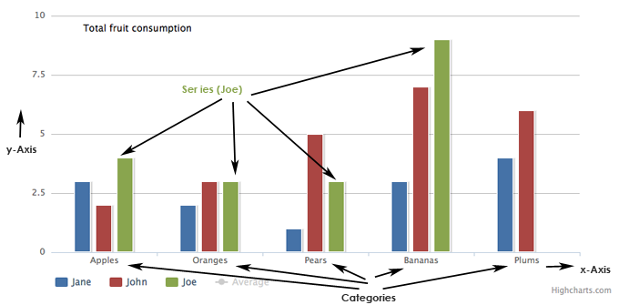
That’s how the rendered result looks like:

Barchart Original Terminology
We can identify the following objects:
Series
Represents a series of data points usually having one (x value) or two dimensions (x, y values).
Category
A category specifies labels for all data points at a certain index. We can see five data points per series in the example, which are labeled with ‘Apples’, ‘Oranges’, etc.
Axis
Describes either an x-Axis or y-Axis of a plot. Sometimes there are even more than one x-Axes or y-Axes.
That’s where things become complicated. Often the results become confusing because of different scales for one direction at the same time.
The proposal
Okay here’s a proposal of a more data-centric less graphic-centric object model.
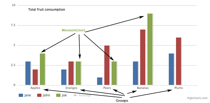
Group
Groups like categories are used to distinguish different kinds of data points (Apples/Oranges/Pears or Male/Female). Nothing special. Each data point must be assigned to a group (if there are groups at all).
Measure
A measure describes an arbitrary numeric property that can be visualized in some way. It holds a list of data points
That’s all.
Of course there’s no information about the graphical representation. But I think this should be separated. It’s just another layer of abstraction. And I was told abstraction is always a good thing in computer science ;—)
A complete visualization workflow would look like as follows:
- Initialize the chart by passing some data (groups and measures)
- Ask the chart (respectively the user) which plot types (bar, line, scatter, pie) are available for the data provided
- Specify plotting options that are relevant for the currently selected plot type
Let’s look at an example:
  $('#chart1').chart({
  	groups: ['Apples', 'Oranges', 'Pears', 'Bananas', 'Plums'],
  	group_assignments: [0, 1, 2, 3, 4],
  	measures: [{
  		name: 'Jane',
  		data: [3, 2, 1, 3, 4]
  	}, {
  		name: 'John',
  		data: [2, 6, 5, 5, 6]
  	}, {
  		name: 'Joe',
  		data: [4, 3, 3, 6, 9]
  	}],
  	plotOptions: {
  		defaultplotType: 'bar',
  		chartTitle: 'Fruit Consumption By Fruit'
  	}
  });

Barchart Proposed Terminology
I just replaced the term Categories with Groups. This 1D data (is it really 1D?) example is a special case where each data point of a measure belongs to one group. So the group_assignments option is redundant in this case and can be left out.
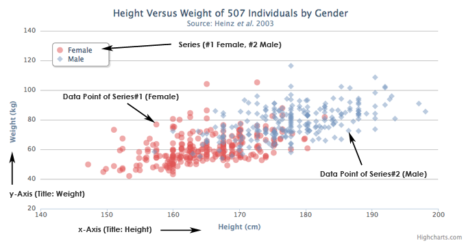
However the benefit of this alternative object model becomes more obvious if we are looking at 2D data, which is represented as Points (x, y values) in the common old school format.
  var chart = new Highcharts.Chart({
     chart: {
        defaultSeriesType: 'scatter',
     },
     title: {
        text: 'Height Versus Weight of 507 Individuals by Gender'
     },
     xAxis: {
        title: {
           text: 'Height (cm)'
        },
     },
     yAxis: {
        title: {
           text: 'Weight (kg)'
        }
     },
     series: [{
        name: 'Female',
        color: 'rgba(223, 83, 83, .5)',
        data: [[161.2, 51.6], [167.5, 59.0], [159.5, 49.2], [157.0, 63.0], [155.8, 53.6]]

     }, {
        name: 'Male',
        color: 'rgba(119, 152, 191, .5)',
        data: [[174.0, 65.6], [175.3, 71.8], [193.5, 80.7], [186.5, 72.6], [187.2, 78.8]]
     }]
  });

Scatterplot Original Terminology
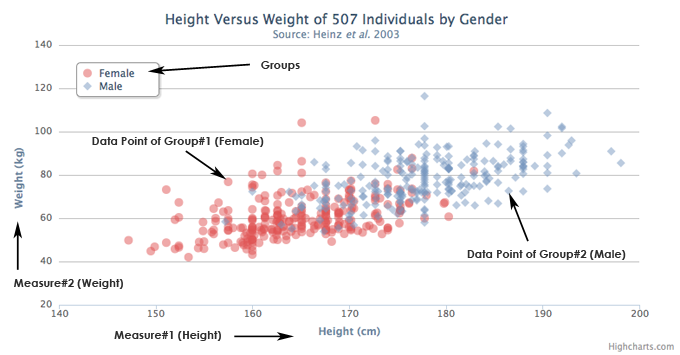
Again we can describe the data using Groups and Measures:
$('#chart1').chart({
   groups: ['Male', 'Female'],
   group_assignments: [0,0,0,0,0,1,1,1,1,1],
   measures: [{
     name: 'Height (cm)',
     data: [161.2, 167.5, 159.5, 157.0, 155.8, 174.0, 175.3, 193.5, 186.5, 187.2]
   }, {
     name: 'Weight (kg)',
     data: [51.6, 59.0, 49.2, 63.0, 53.6, 65.6, 71.8, 80.7, 72.6, 78.8]
   }],
   plotOptions: {
 		defaultplotType: 'scatter',
 		chartTitle: 'Height Versus Weight of 10 Individuals by Gender'
   }
});

Scatterplot Proposed Terminology
As you see measures are always series of numbers (it’s just 1D). If you want to render a scatter plot you’d probably take the first measure, assign it to the x-Axis, and use the second measure for the y-Axis. 2D. Finally. Since you can pass arbitrary many measures you can specify infinitely many dimensions. It’s up to you how to visualize them ;—) You may use the dot size of each data point to visualize a 3rd dimension. The group assignments option assigns each data point to a group so we can outline them accordingly.
Using the proposed (generic) object model it’s easier to pass arbitrary data to the chart. After this has been done, the chart itself can tell its available plotting options (e.g. Barplot, Lineplot for one measure/group etc.).
I don’t have much theoretical background in statistics and data visualization. However this is just what came to my mind and feels natural to me. I’m going to change the API of the charting library I’m working on to fit the proposed model.
What are your thoughts about this topic? Can this work out? Am I missing something? I’d really love to have some discussion. Even the naming needs to be discussed — I’m not sure about ‘Groups’ and ‘Measures’.


